In the journey to develop the ECONYL® Global Color Range, we explore and ponder on the connections between design, colors and sustainability and how this relationship has changed over the years.
Cromorama (Einaudi) is an excellent book about the history of color published in Italian, by designer Riccardo Falcinelli. It tells the great story of how the perception of colors changed in history and how that change is firmly connected to society and the birth of design and fashion.
“Design, long before producing objects, produces conversations; know how, beliefs, myths, behaviors and social practices that have a mass scale and a common denominator.”
“Understanding color involves not only knowing what it means but also, and more important, knowing how it works.”
We chose these two quotes from Falcinelli’s book to introduce two exciting concepts he talks about. The first is that color in its modern form was born together with design and with the society of mass consumption. The second topic is that color is not a tangible thing per se, but it is a range of meanings connected to the use that society makes with it.
Colors in ancient times were very different from what we know today. For example, when talking about ultramarine blue in ancient times, the speaker was not imagining a generic blue color but was probably thinking about the material used to make that color; so, in this case, a mineral, the powder from lapis lazuli. This was a precious material that Marco Polo brought from his journey in the Far East and that he mentioned as one of the most valuable treasures he had brought. In fact, this color was the one used in the Renaissance for the veil of Virgin Mary. There is also a contract that the famous painter Botticelli signed in 1485 where it is stated that he would be paid 2 florins (the currency in Florence at that time) for ultramarine blue, 38 florins for gold color and 35 for “his paintbrush” (his art). This information about price and the fact that colors were even mentioned in the contract of artists tell us that colors were valuable, expensive, hard to find, hard to produce, hard to stabilize, and impossible to mix as they were coming from different origins (from insects, minerals, soils and flowers).
These limitations about color changed with industrialization. With mass production, there was the need to stabilize colors, produce them in high quantities, create a system of identification and make them consistent in time and in all the places where they were manufactured. Chemistry and physics were involved to develop a new method to normalize and classify colors as well as to create them artificially.
The first dye to be produced synthetically was mauve. In his book, Riccardo Falcinelli tells the fascinating story of this color. Like many things in history, it was a casual invention by William Henry Perkin, a young student at Royal College of Chemistry who, in 1856, obtained a strange dark substance while trying to synthesize quinine (used as an antimalaria treatment). Once dissolved in alcohol, the dark substance resulted in a unique violet dye that was tested by Henry Perkin on silk. He noticed the color was stable and resistant and decided to patent it with the name “mauveine.” A dress with this unique bright violet color was worn by Queen Victoria for her daughter’s wedding, and it was a great success. Everybody wanted it, and Perkin started the first mass production of a dye.

It was a big moment in history, and from that moment on, the companies that we know today as the giants of chemistry – Bayer, Ciba Geigy or Basf – were involved in a race to produce more and more colors: Prussian blue, Cobalt blue, Chromium Orange, Cadmium Yellow and many others. Colors were free from their natural ingredients, and there were no limitations in their creation and blending.
These endless possibilities with colors were also the beginning of modern fashion and design. Colors were an essential element in the mass production of design objects, and they became part of that conversation that Falcinelli was talking about, a dialogue between the design of artifacts, their aesthetic properties, and society. Objects were to become more and more vehicles for the construction of the self, in a constant and deep relationship with what people wanted to tell about themselves.
In his illuminating book The Shape of Green, Lance Hosey points out the importance to include aesthetics in sustainable design because “we don’t love something because it’s nontoxic and biodegradable – we love it because it moves the head and the heart.” The whole book is a series of in-depth analysis of how beauty could save the planet and how designers and architects should include aesthetic attraction not as a superficial concern but as an environmental imperative.
Regarding color, Lance Hosey points out that the color theory is not often taught in architecture school so “designers tend to begin with a distinctive form, to which color, texture, and patterns are applied after the fact, if at all.” But color can be a powerful design tool as it can influence emotions and affect thermal comfort.

Lance Hosey mentions a study done in 2012 in Germany that found that just glancing at natural shades of green can boost creativity and motivation. Another great example refers to the solar orientation of a space and its effects on color rendition. So “north-facing rooms have bluish tint because outside light is reflected from the sky – designers can plan a palette that both aids perception and adjust occupants to the environment outside.”
Extremely interesting are the studies that Hosey mentions about thermal comfort, energy savings, and colors. “Darker paint absorbs more light, requiring more artificial lighting, so brighter shades, especially on ceilings can save energy.” And if you believe that the energy saved with this ‘color trick’ is negligible, here is a figure that will make you think otherwise. According to Steven Chu, U.S. Secretary of Energy, brightening the colors of all the roofs and pavement in the United States would slash emissions as much as banning all cars for eleven years.
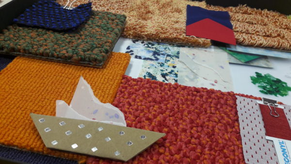
Today the most significant innovations about colors are connected mostly to the way they are produced. Our ECONYL® Global Color Range is all solution dyed yarn, so this means that the dye is added in the polymers before the fiber is extruded. So, if you were to cut a section of the yarn, not only would the outside be colored as in yarns dyed after extrusion, but the inside would also be colored. This means that it is nearly impossible to fade or bleach the color out of the carpet. Also, we made sure that all colors were created in the most sustainable way as we are producing our polymer, so we have control over the process. All the colors in the range, in fact, support the Cradle to Cradle certification, either Silver or Gold.
This particular attention to sustainability of the process is a must for our ECONYL® yarn, which comes from regenerated waste materials – spent fishing nets, old carpets and other discarded nylons – recovered all over the world and transformed into raw material for new fiber used both in carpet flooring and fashion. Today more than 190 brands of the fashion world, and more than 60 of the flooring industry, are using already this yarn.

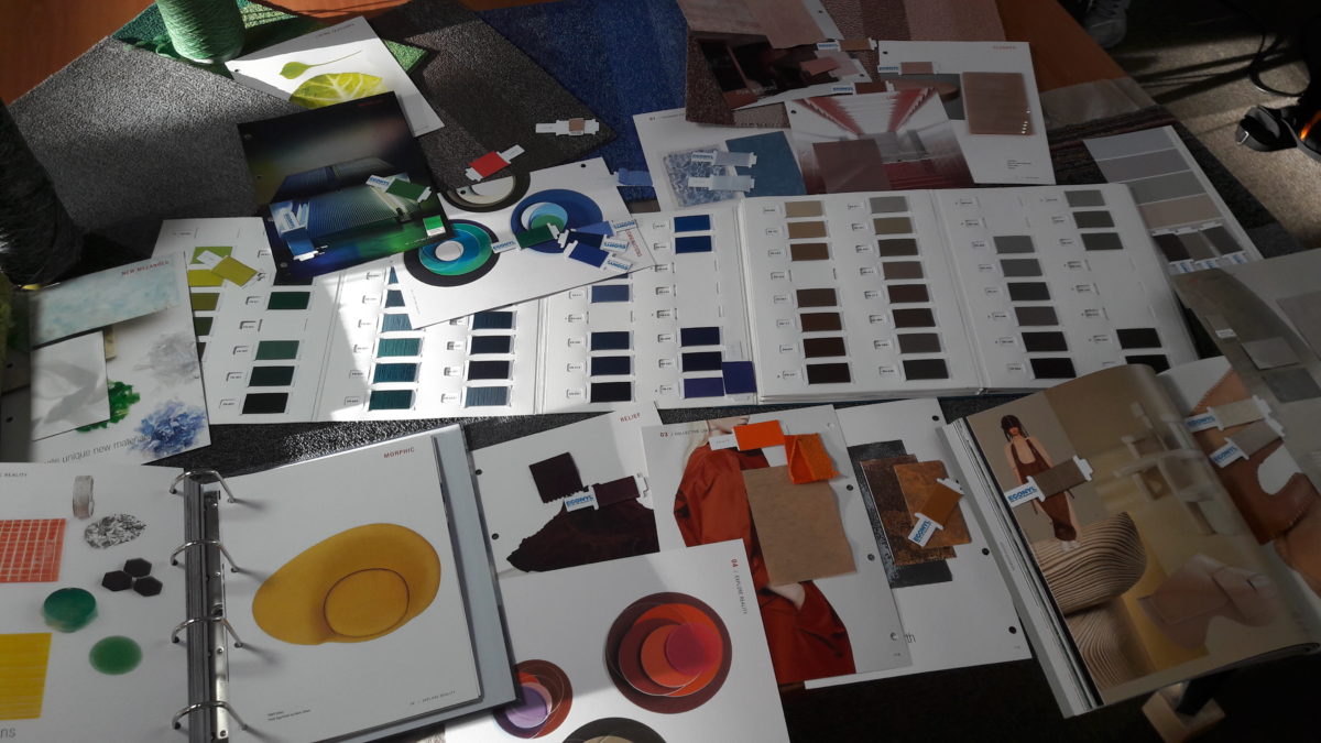
The ECONYL® Global Color Range has 28 new colors and a total of 170 colors ready for any designer who wants to use a sustainable ingredient that has no compromise in quality because ECONYL® yarn is 100% regenerated from waste and also gives 100% performance with the same quality as virgin nylon.
170 colors of yarns mean in reality many more, as colors can be mixed to create infinite color effects; they can be combined in the yarn itself, or in the carpet. The thread can also have different reprocessing (air entangling and twisting) that can give different effects to the color of the final carpet.
“Intelligent color choice can contribute to character, conservation, comfort, wayfinding, mood, maintenance, and financial savings all at once. So why is it missing from the standard toolkit of sustainable design?”
We agree with Lance Hosey that color is a powerful tool in the hands of designers and should not be missing from the standard toolkit. That’s why we are happy to present our ECONYL® Global Color Range for designers to use, have fun with and explore the infinite possibilities.
Originally posted on Medium.
